The RP Design System provides a flexible and cohesive visual framework allowing designers to quickly build experiences and powers over ten SaaS apps that make up the Red Platform product suite.
My role
Typography, Color System, Design Components, Documentation, System Governance Structure, Evangelism
Results
- Increased team efficiency by 40%
- Unified design across 10+ SaaS applications
- Reduced time-to-market for critical features
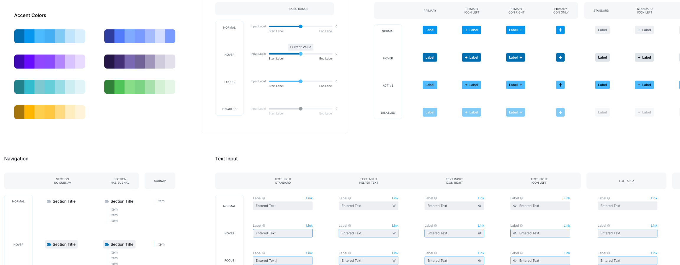
Our department reorganized and multiple apps using different design patterns and frameworks across different teams now needed support. I built a flexible design system to unify our platform.
Because several of the applications we supported were built before our design system initiative, I started with an audit of existing applications with other designers to identify areas of overlap and define a MVP component set that would allow us to apply the system across our products.
The initial result of this audit was a unified spacing system, color system and typography scale that could be implemented without creating significant tech debt for our engineering teams.
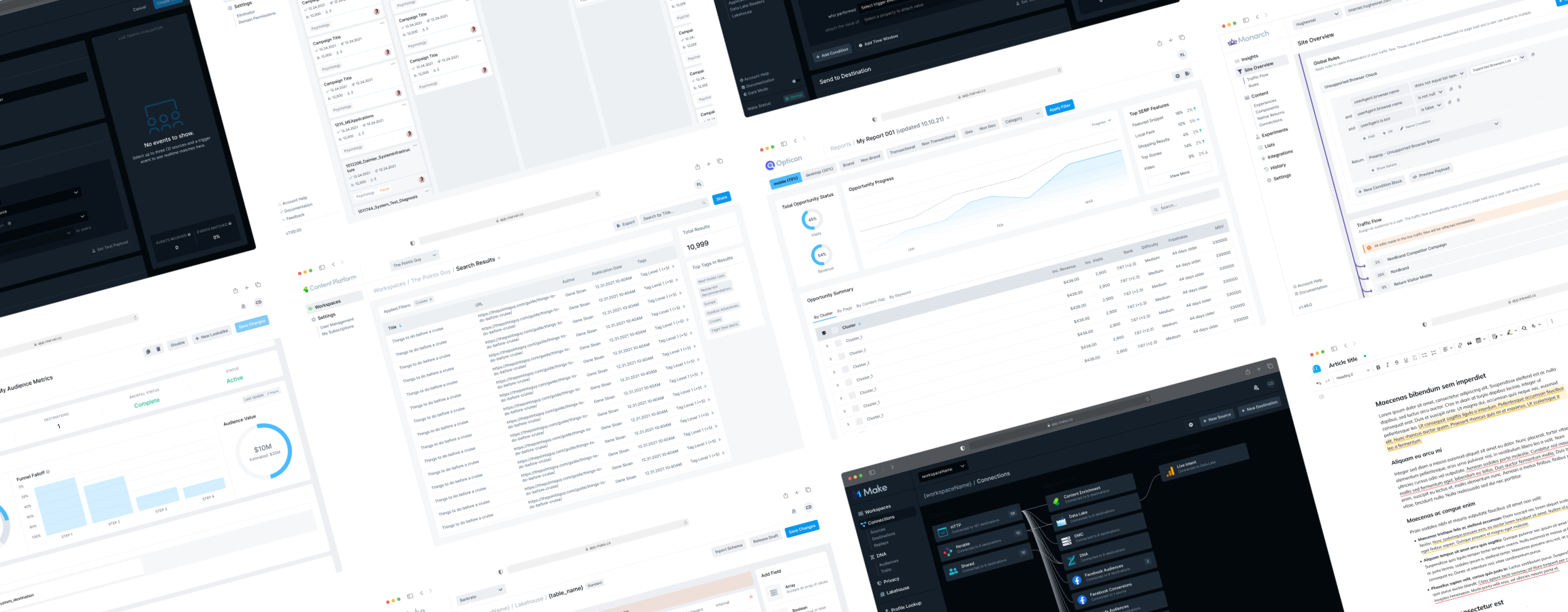
I started by talking to my team to understand their needs, giving me insights for system governance. I made a three level structure that gave designers flexibility and a path to add new patterns to the system.
We needed a system that was flexible due to the diverse needs of the apps we supported. I defined three levels for our system: local for needs within a specific product feature, product for patterns used across multiple features in a single product, and finally the global layer used across all products that had our core patterns.
This allowed us to promote new patterns to the global level as they gained adoption and moved up through the different system levels while maintaining flexibility for individual designers to move quickly as they designed new interactions and experiences.
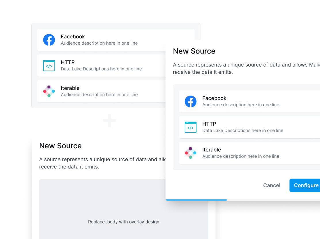
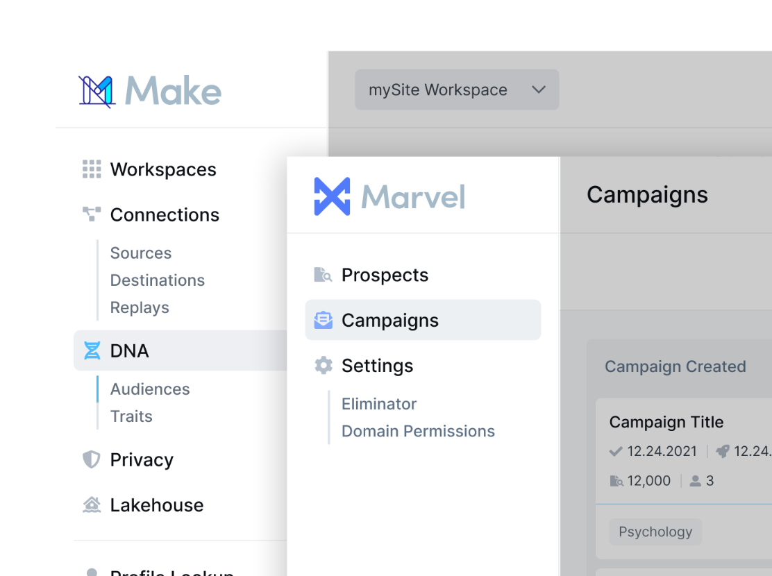
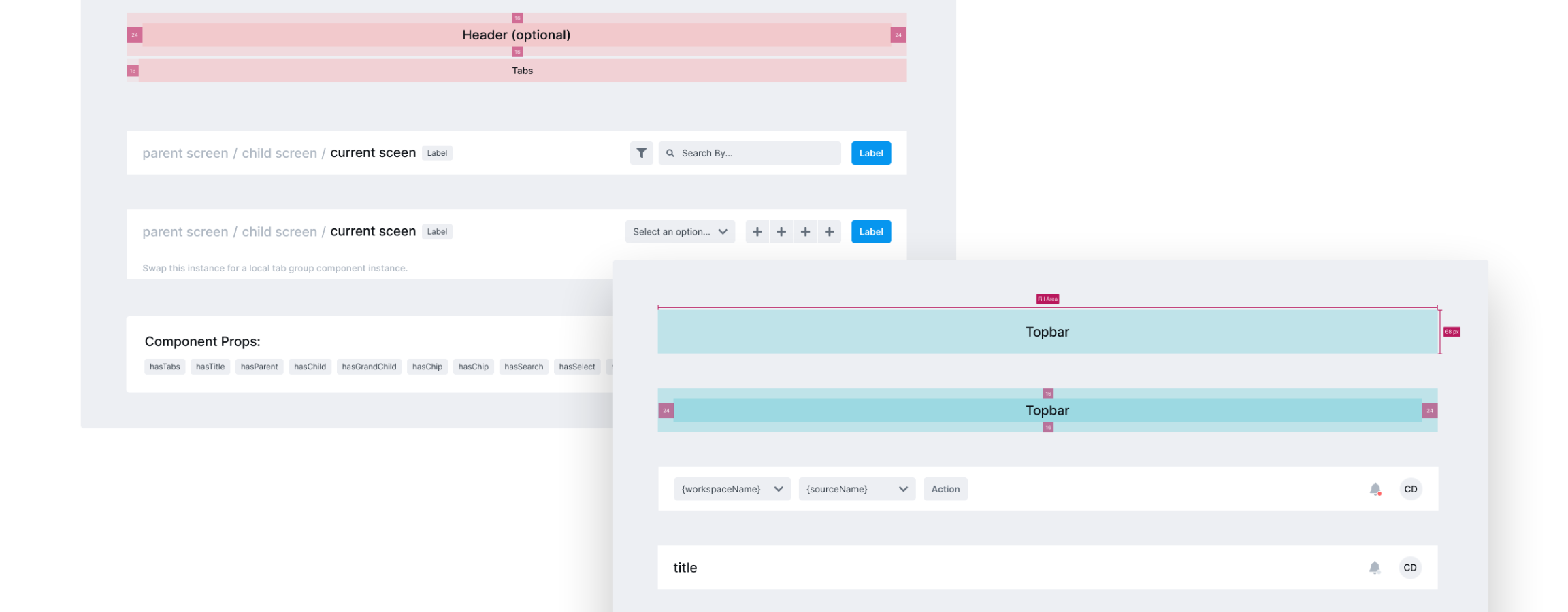
To reduce maintenance, I kept our core pattern libraries to basic components like buttons and inputs with a small library of more complex global patterns like modals, tables, and navigation.
The next phase of the system defined a set of core components like buttons and inputs. I worked with engineering to better understand how these components functioned and how to name them to make it easier to identify which code component they should use when implementing designs.
A challenge I faced with our pattern library was that each product team used a different framework. I drove conversations with engineering leadership across teams to identify how best to implement our system and aligned on providing the visual layer using CSS while letting the existing frameworks handle the component structure in each product.
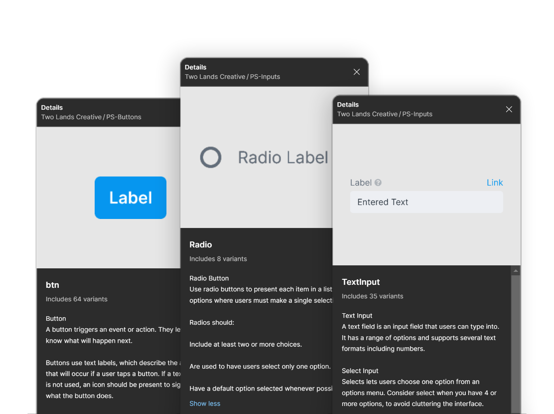
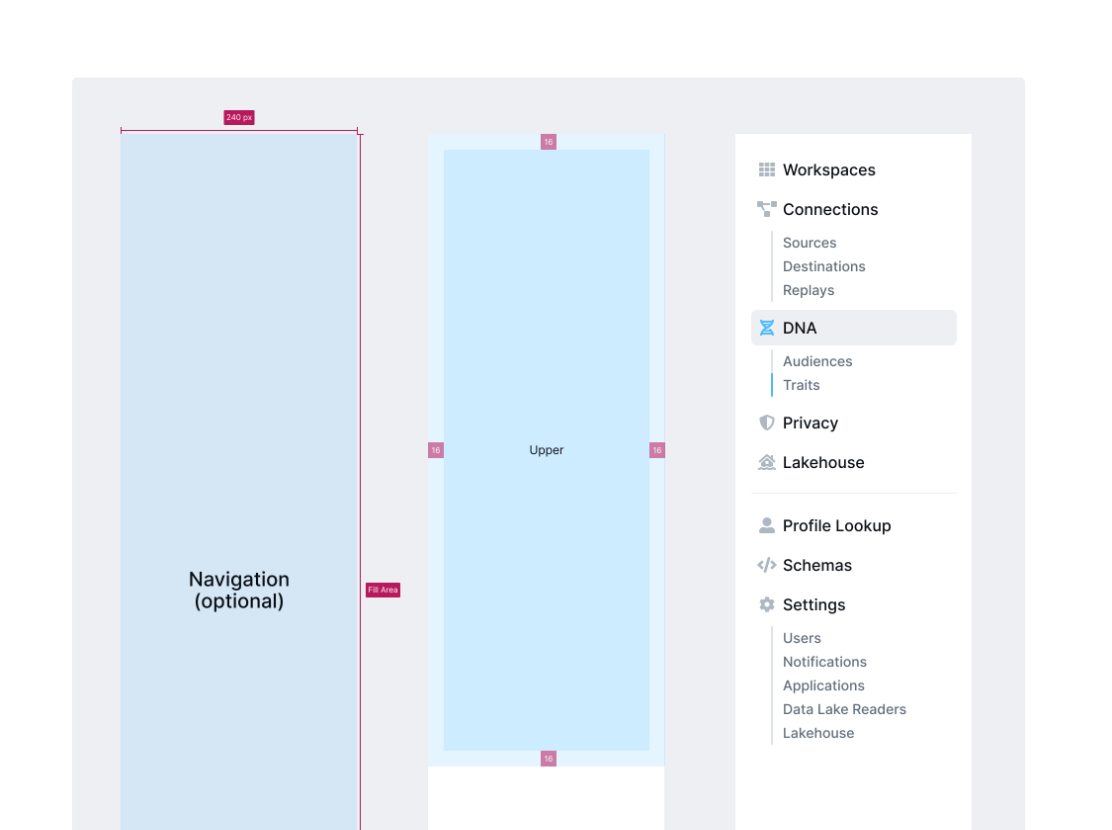
I documented each pattern in Figma to give designers usage guidelines as well as created docs in Confluence outlining spacing, app structure, and component props for our engineers to reference.
Finally, I wrote documentation for designers and engineers to provide a source of truth for the system's foundational rules. For each component, I wrote usage guidelines within the component to provide designers with information about intended usage in the moment, allowing designers to build with confidence without breaking their flow.
To codify higher level patterns like app structures, spacing and props, I wrote comprehensive docs in Confluence that could be accessed by both designers and engineers. These docs simplified onboarding and improved consistency of system implementation across multiple teams and designers.
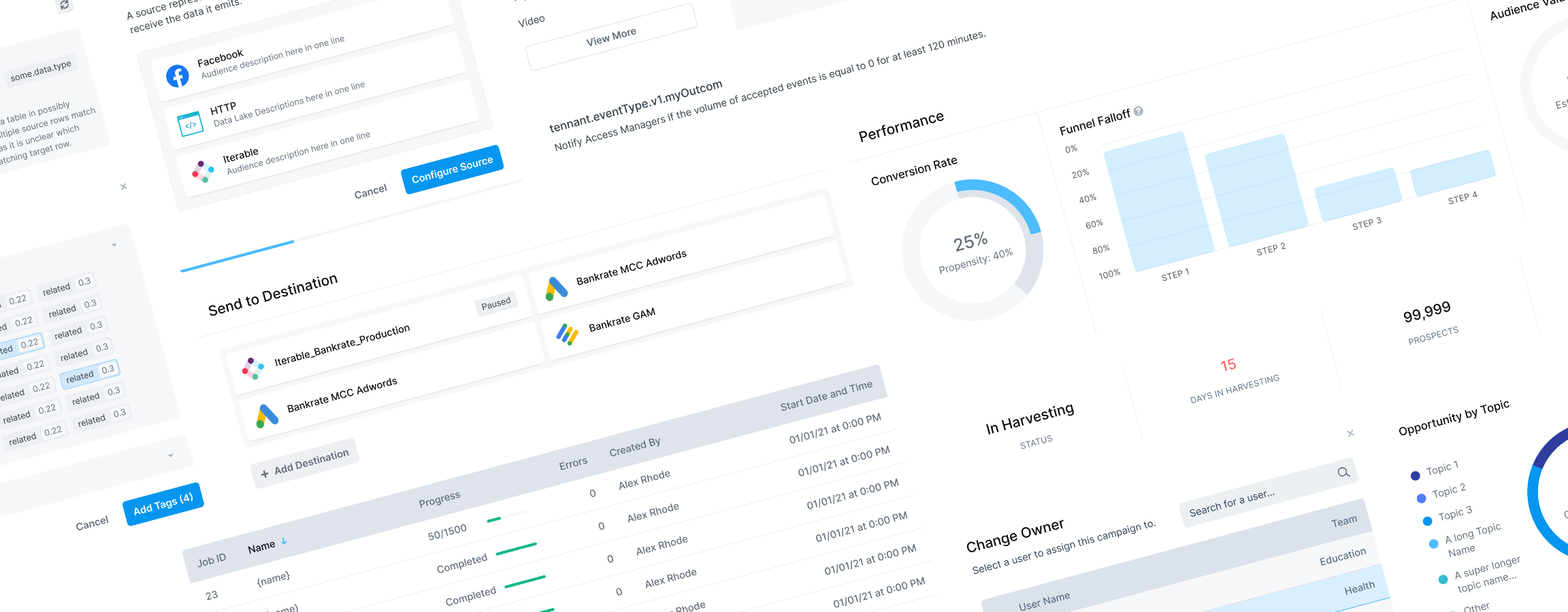
My design system increased our team efficiency by 40% giving us time us to test our designs to identify winning experiences, increasing stakeholder buy in and improving consistency across our app suite.