Harbinger is a zero code SaaS platform that unifies data structure by sharing and extending models across teams making it easy for anyone to update product data for consumers using a visual interface.
My role
User Flows, UI Design, Interaction Design, Prototypes, User Research, User Testing, Design Leadership
Results
- Improved data consistency across teams
- Reduced data input errors by 20%
I joined the team to lead the app redesign. After talking to our users, we found they struggled finding critical data they needed, using the draft system, and understanding how data models worked.
Harbinger’s purpose is to unify how teams managed similar types of data and served that data to consumer experiences. Our key metrics were user efficiency and data accuracy.
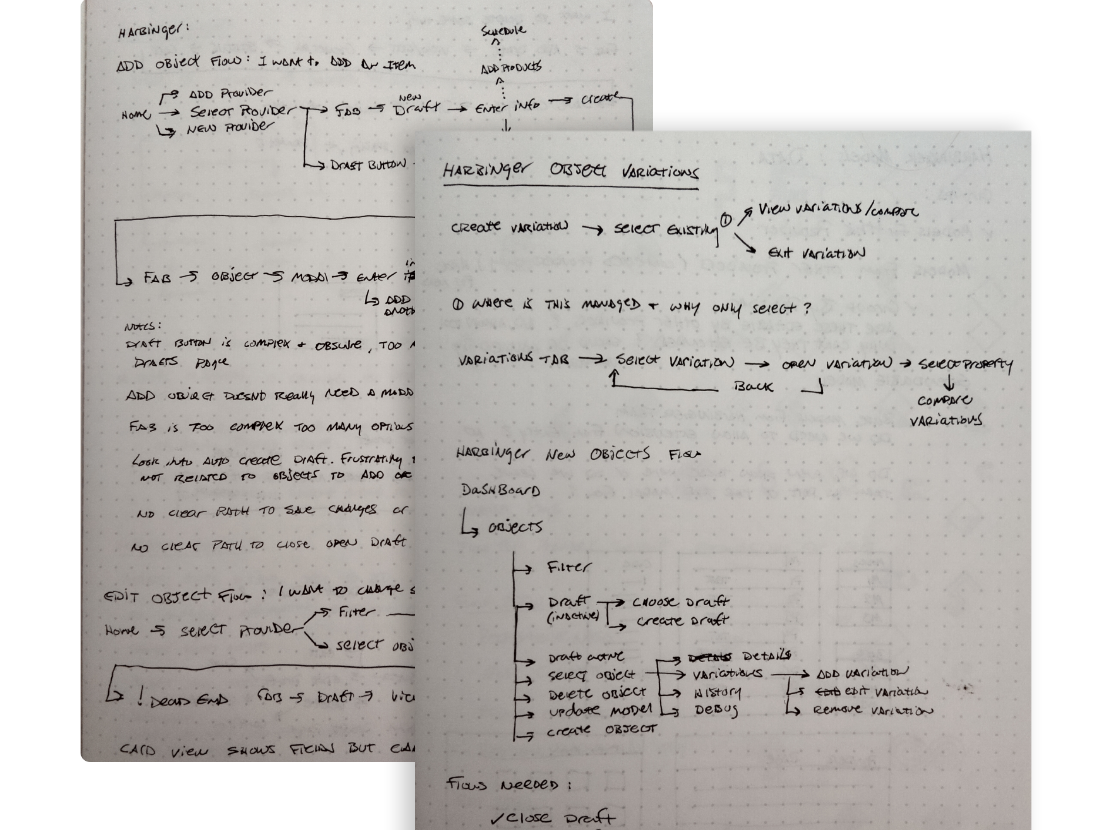
I set up interviews with people across teams to learn how they used the app and with our engineers to learn how it worked. This helped me find where people struggled when using the app and align the team around the most impactful areas we could improve to reach our goals.
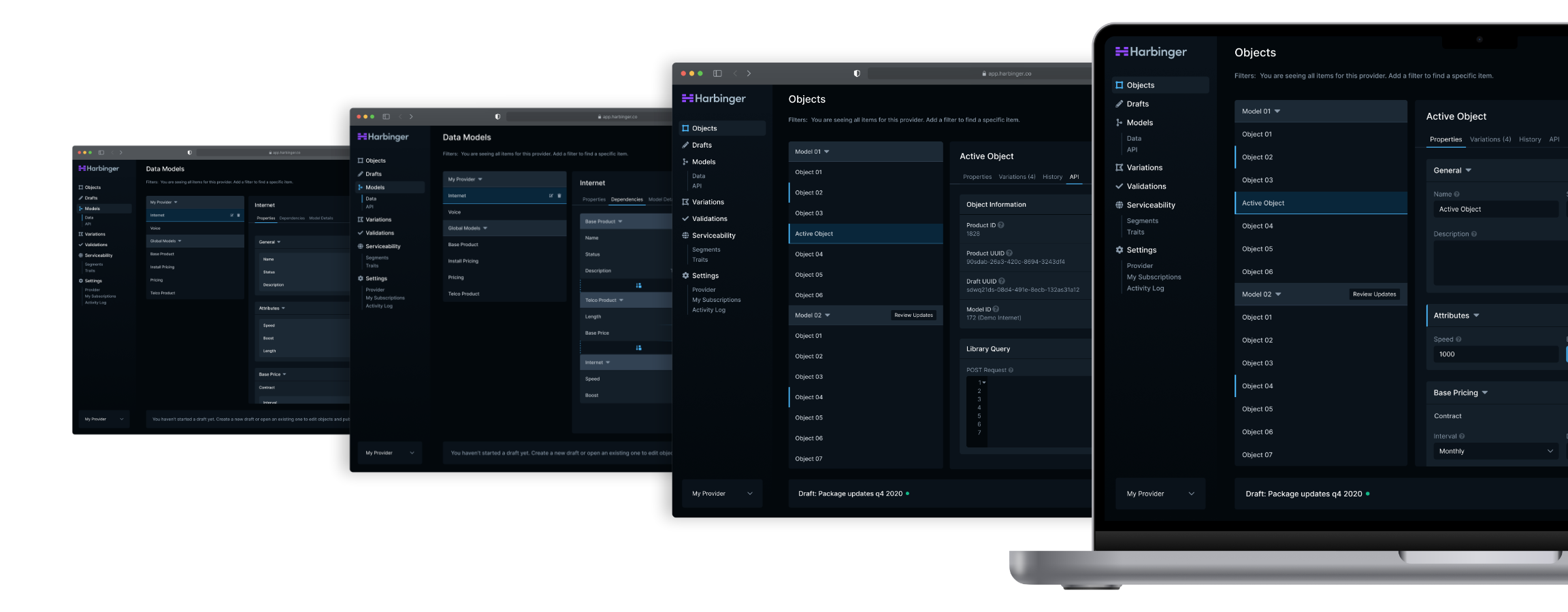
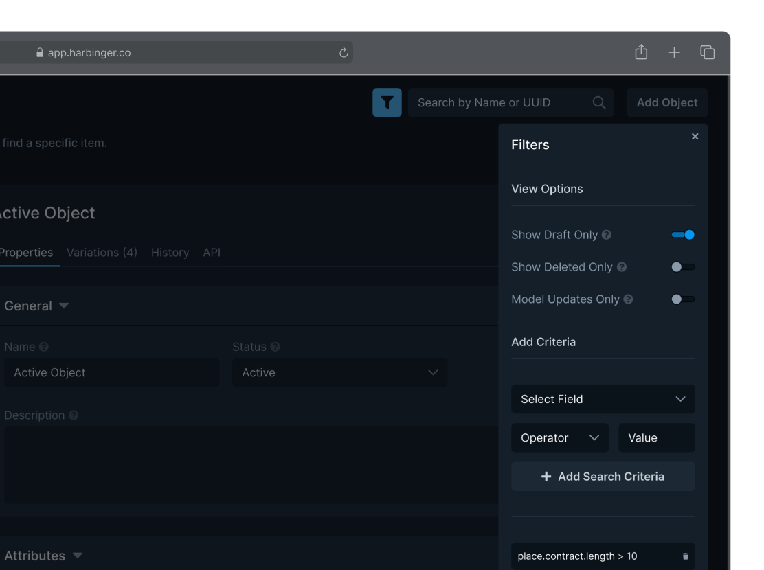
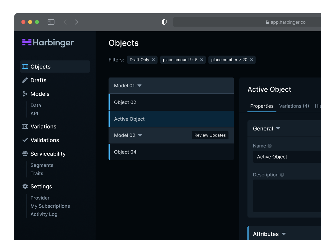
Large shifts in the layout made it hard for users to find data they needed in the app. I designed consistent UI patterns that made finding and managing data easier, improving user efficiency.
Iterating through a series of prototypes, I designed flexible UI patterns and created a pattern library to improve consistency. We reimagined search and created a contextual experience that showed applied filters that made it easier to find data.
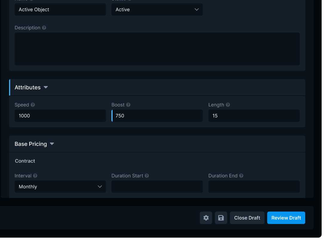
To improve how users interacted with data and better focus critical data, I created a flexible, list-based view with a tabbed panel showing information about active item that was reusable, saving engineering resources and increasing data visibility.
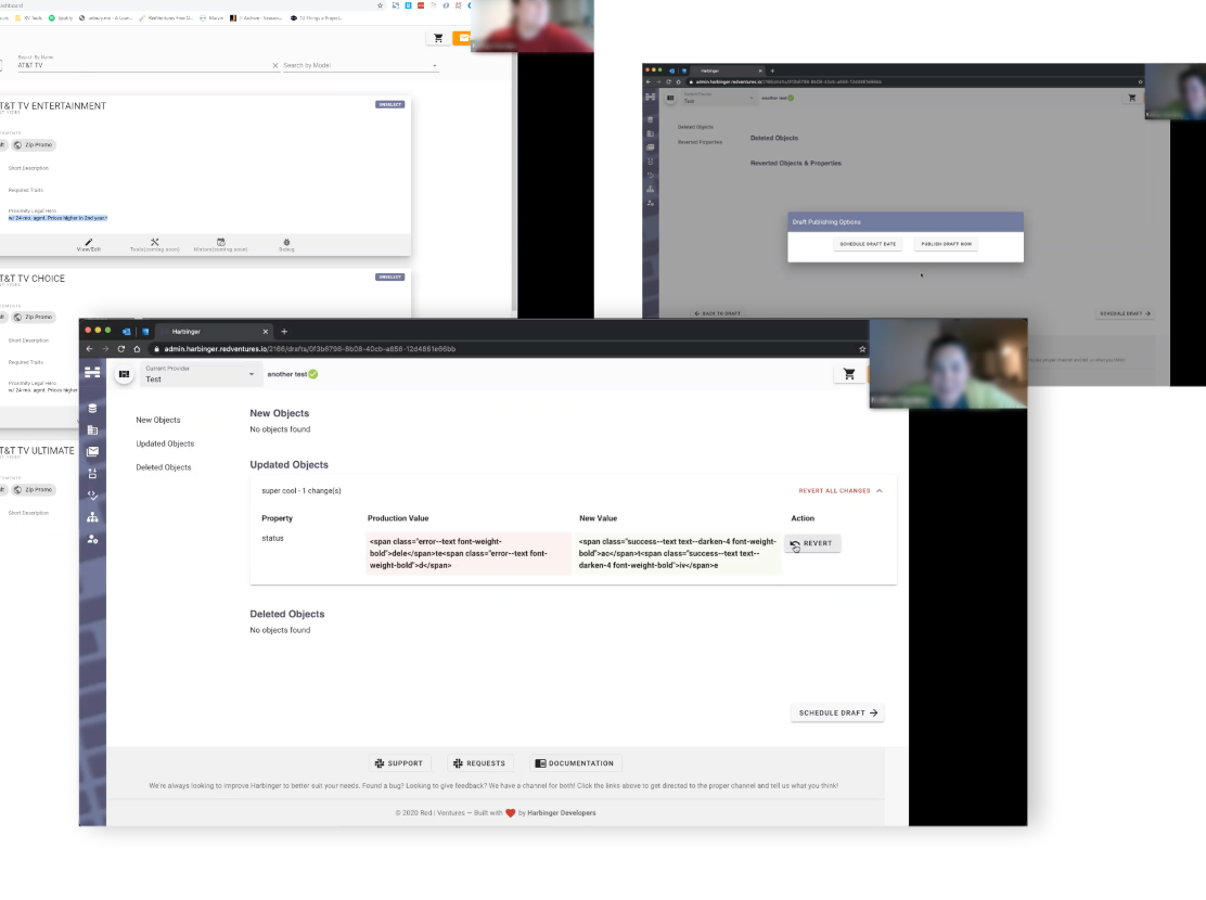
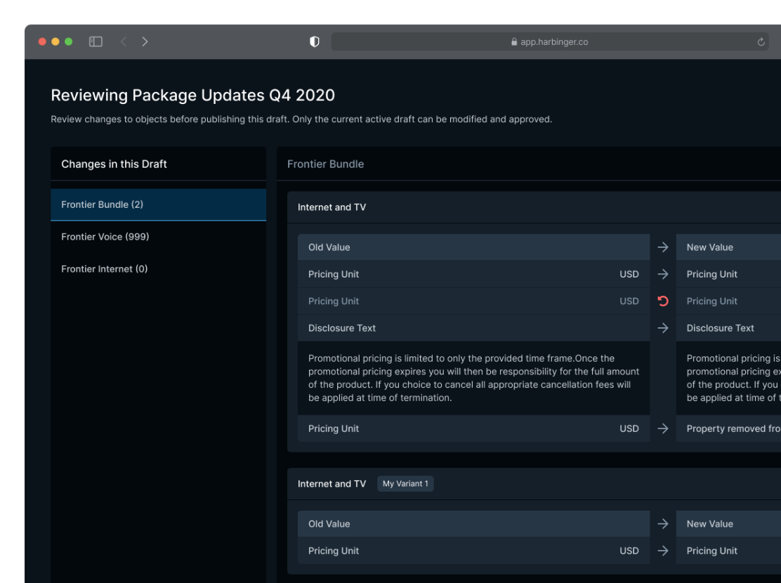
Drafts frustrated users because critical info wasn’t surfaced when opening or publishing drafts. Using prototypes to iterate, we improved awareness and reduced errors by 20%.
I began work on updating how drafts functioned, regularly including engineering in the process and scheduling moderated test sessions or focus groups to gauge how well the designs were addressing user pain points.
We created a new draft system that clarified when a draft was active using a persistent draft bar and added visual indicators of what data the draft changed. A new draft publishing view grouped changes for easy access and removed unclear interactions allowing users to publish updates with confidence.
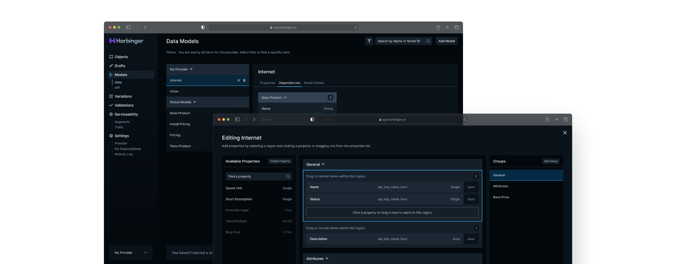
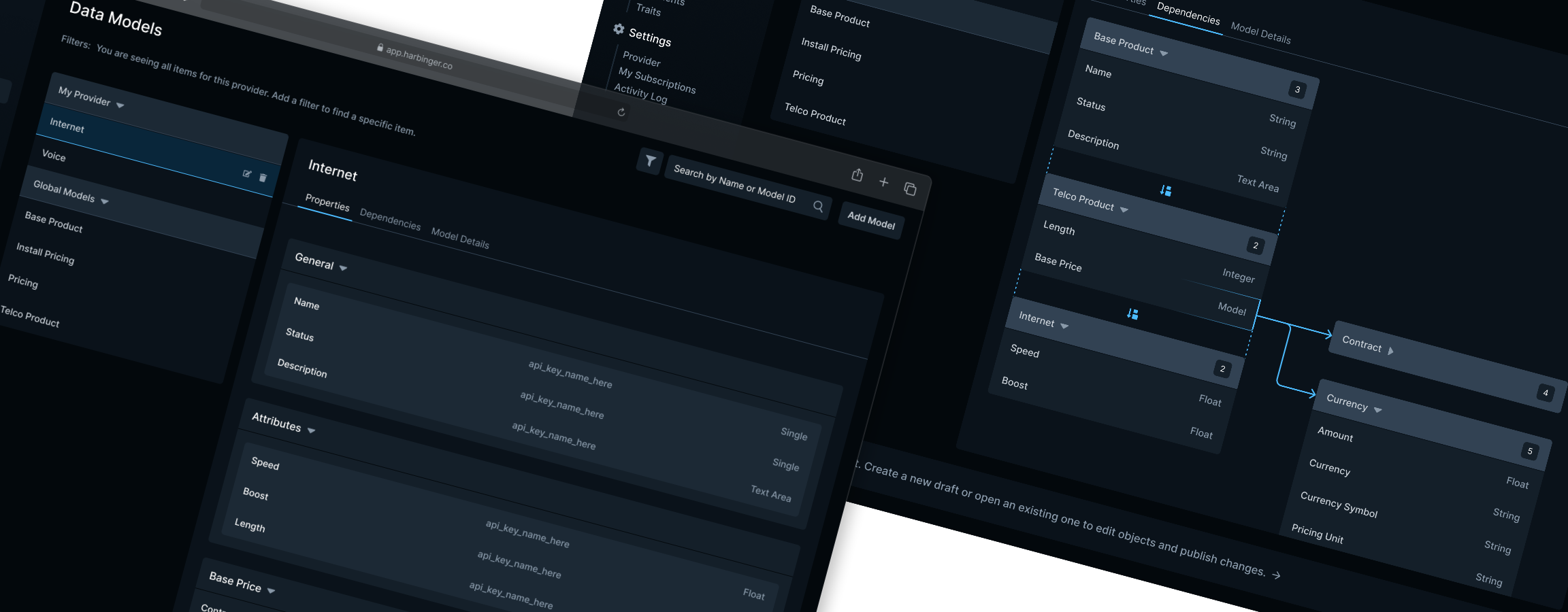
From our research we learned users didn’t know how data models worked. Visualizing the model structure helped them see how properties, objects and models connected their data.
Harbinger allowed users to pick a base data model type and extend that model with properties unique for each business. While this helped reduce duplicate models, it also became difficult to know how data was structured or how that structure impacted data editing.
I solved this by creating a view for properties that visually displayed a flattened model that followed the layout seen when editing data. Next, I designed a collapsible tree view that showed how models were connected and where a model was extended. These updates improved our users autonomy and reduced the help tickets our team received.
The redesign resulted in more accurate content for consumers due to a 20% reduction in data input errors published to live experiences and helped unify data across teams at Red Ventures.